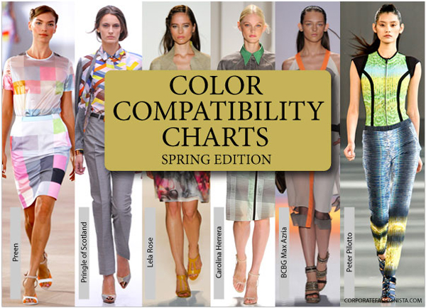
Walk into any store this spring season and what do you see…c-o-l-o-r!
And loads of it. Stores are jammed packed with updated designs in a delightful array of colors guaranteed to take your spring style to a whole new level. Designers went crazy for color and I love it! They continue to challenge us to step outside our comfort zone and learn to embrace fashionable updates.
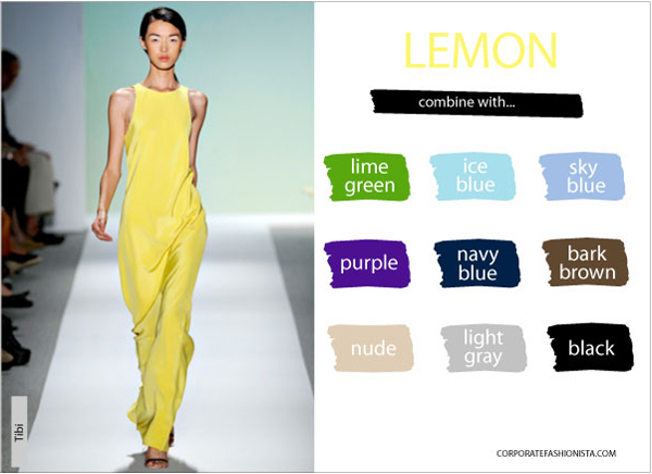
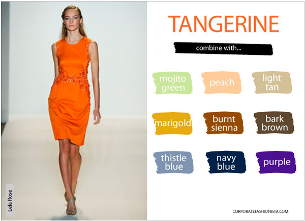
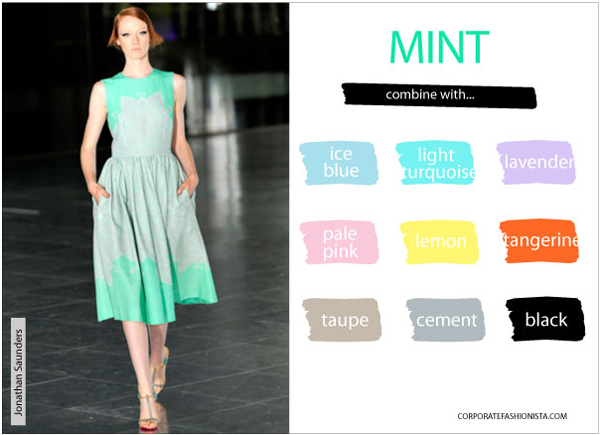
A kaleidoscope of colors is available, right now, certain to enliven your wardrobe. I’ve put together the spring edition of CF’s Color Compatibility Charts for you as a reference guide, so you don’t have to think about which colors go well with each other this season. There are a total of three charts. Each one showcases one of the three most popular, but trickiest to mix, spring colors and then presents a handful of my favorite color pairings inspired from the runway.
It’s likely you will not wear these trend colors from head-to-toe to the office, but opt to add them sparingly as accent colors. You’re welcome to tone down each color’s intensity as you see fit, too. Join the color celebration…you’ll instantly look fresh and modern!


Let me know what you think of CF’s Color Compatibility Charts? And what recommendations you might have to tweak them for additional value?
Image credits, runway spring 2012 rtw via Style.com: Top, Preen, Alessandro Garofalo, GoRunway.com; Pringle of Scotland, Lela Rose, Carolina Herrera and BCBG Max Azria, Yannis Vlamos, GoRunway.com; Peter Pilotto, Marcus Tondo, GoRunway.com. Lemon, Tibi, Alessandro Viero, GoRunway.com. Tangerine, Lela Rose, Yannis Vlamos, GoRunway.com. Mint, Jonathan Saunders, Alessandro Viero, GoRunway.com.

The question is: which chart flatters skin tone/hair&eye color? As an olive/brunette, neither lemon nor this year’s yellowish tangerine are good for me and mint is a distant maybe.
Bess – Great question! You’re right; the trend colors highlighted in these color charts all have cool undertones.
As a general guideline, if you’re someone who looks best in silver jewelry or a bright white top then go for these exact colors. However, if you are someone who looks best in gold jewelry or an off-white/ivory colored top then it would be best for you to opt for yellow, orange or green colors with warmer tones. This way you can still participate in the trend, you’ll just have to tweak it.
One’s skin color, eye color or hair color rarely determine undertone, so I went ahead and reviewed your online profile pics and here are some samples for you from Nordstrom…1) Yellow: http://bit.ly/I52UK7 – sunny yellow vs. lemon yellow 2) Orange: http://bit.ly/IEN0V4 – orange (juice) vs. tangerine 3) Green: http://bit.ly/IhZR0s or http://bit.ly/IIKfF7 kiwi or grass green vs. mint ice cream. All these food references are making me hungry! 😉 Please note online pics may differ in-person, but from what I can see these should work for you.
Great suggestions though I think I am a little late in discovering this wonderful blog of yours. I will be waiting for your blog on color compatibility for summer!
Welcome, Kim! Glad to have you join the fun!